
Haring Realty Blog
 RSS Feed
Subscribe and receive email notifications of new blog posts.
RSS Feed
- 2024 | 10 Posts
- 2023 | 48 Posts
- 2022 | 48 Posts
- 2021 | 48 Posts
- 2020 | 49 Posts
- 2019 | 46 Posts
- 2018 | 52 Posts
- 2017 | 110 Posts
- 2016 | 78 Posts
- 2015 | 7 Posts
Area News and Information | 16 Posts
Ashland Ohio | 2 Posts
Bellville Ohio | 3 Posts
Buy a House | 56 Posts
Community | 2 Posts
Distressed Properties | 9 Posts
Finance | 2 Posts
Galion Ohio | 1 Posts
Haring Realty | 1 Posts
Home Maintenance | 13 Posts
Home Maintenance Tips | 10 Posts
Homeownership | 109 Posts
Housing Market | 32 Posts
Housing Market | 89 Posts
Lexington Ohio | 2 Posts
Lucas Ohio | 2 Posts
Mansfield Ohio | 64 Posts
Marketing | 12 Posts
Money-Saving Tips | 1 Posts
Moving Tips | 4 Posts
Ontario, Ohio | 2 Posts
Richland County | 3 Posts
Sell Home | 4 Posts
Selling Your Home | 52 Posts
Shelby Ohio | 2 Posts
Tips for Buyers | 1 Posts
Tips for Sellers | 1 Posts
Uncategorized | 1 Posts
January
11
11
Home Decor: Colors of the Year for 2021
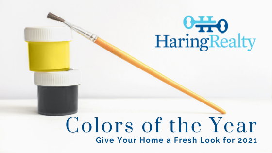
Major paint companies and color experts have once again announced their colors of the year. They're expected to be the top shades in design, and many reflect what we're looking for in the new year. Some are vibrantly optimistic, while others are soothing.
The following are some 2021 colors of the year, and our REALTORS® suggest ways you can incorporate them into your home.
- HGTV Home by Sherwin-Williams – Passionate HGSW2032
The color palette for 2021 will be all about vibrant colors, according to Sherwin-Williams. The company's Passionate HGSW2032, a rich, bold red, is its 2021 color of the year. It can create a backdrop for neutral furniture paired with accents inspired by nature. Or pair it with a vivid blue or green for a more vibrant look. - Illuminating (13-0647) and Ultimate Gray (17-5104) – Pantone
Pantone usually chooses a color of the year, but it chose two colors in an effort to represent unity in 2021. It describes Illuminating as a bright, cheerful, and warm yellow shade and Ultimate Gray as inspired by natural elements that can stand the test of time. The colors don't have to be used in equal proportions, Pantone says, and as an example, the company recommends painting your front door in the Illuminating yellow to create a bright, cheery entrance and using dependable Ultimate Gray for exterior finishes. You can also paint Ultimate Gray on walls or cabinets in your kitchen and use yellow canisters or tea towels to add a burst of color.
- Aegean Teal 2136-40 – Benjamin Moore
Paint company Benjamin Moore has chosen Aegean Teal, a soothing blue-green, as its color for the year in 2021. It has a tranquil feel to it, and its grey undertones add a touch of modernity to the color. It's recommended for bedrooms as well as home offices (where many of us are spending much of our time these days!) since it's a calming color. Aegean Teal is also a stand-out in the kitchen, where it looks elegant thanks to those grey undertones.
- Metallics
Homeowners often fear that metallics will clash with the rest of their décor. But when used in moderation, it brings elegance to a corner area, for example.
- Orange
Although it may sound like it would just be too much, a vivid orange is a lively color that can fill a room with energy when it's used on walls. If that's a more vital hue than what you're looking for, choose a more subtle shade of orange to add a touch of summer to your rooms. - Gray
You might think it would make your rooms look a little dark and gloomy, but gray can add fresh elegance and style to your home. It works particularly well with the minimalist style of home décor. - Dark Blue
This dark blue is fresh and cheerful, adding warmth and sophistication to rooms. It works particularly well when paired with furniture and decorative elements in ocher, a pale brownish-yellow color.
Contact us at Haring Realty if you're looking for Mansfield homes for sale that incorporate some of the latest trends in décor.